Fun with the Munsell Wheel!

The Munsell colour wheel features in my colour lessons soon to be released on my Online Art School

 In the meantime I thought some of my fellow colour nerds might enjoy this…

 I’ve received several requests to produce a Munsell colour wheel using Michael Harding‘s pigments.

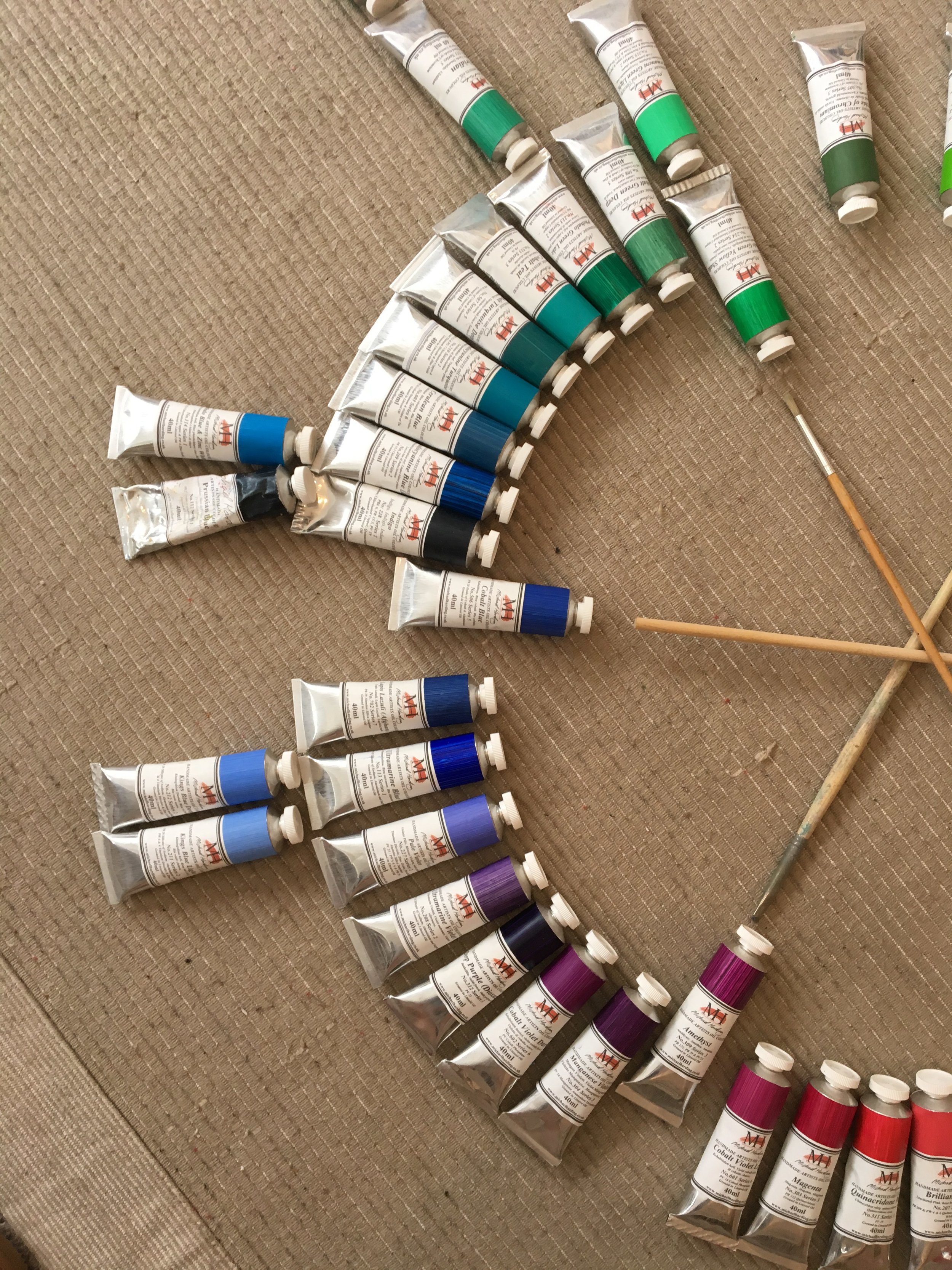
So here it is, my attempt at painting a Munsell wheel using a single tube of colour from Michael Harding‘s range for each segment. It is not possible to produce a perfect wheel in this way because using only a single tube of colour for each segment of the wheel restricts the precise hue I’m able to produce, so I’ve selected the paints that I think will get me closest to the Munsell hues required.

Now let me attempt to explain why I have chosen each pigment and whether I think they are spot-on or just a close approximation. Let’s start with the ‘Yellow’, I’ve chosen Yellow Lake because it’s a bright unbiased yellow, neither green-ish nor orange-ish, it sits squarely in the yellow section of the wheel and has a high saturation level, Cadmium Yellow would also fit this position on the wheel perfectly well and I think this is a really good match for a Munsell yellow.

The ‘Yellow Red’ is also a good match, I’ve used Cadmium Orange and I don’t think there’s anything else in the range that would give such a pure, vivid orange, I considered Permanent Orange but dismissed it because it’s too pinkish.

For the ‘Red’ I’ve selected Scarlett Lake because it offers a good unbiased red, it is rich and deep leaning neither towards orange nor purple. Cadmium Red would do a similar job and Pyrrole Red probably would also be suitable for this position on the wheel.

 For the ‘Red Purple’ I selected Magenta for its high saturation and purple-ish hue. I think Quinacridone Rose could also be used in this place though it would have a slightly less blue bias.

 For the ‘Purple’ I’ve chosen Amethyst because it’s a good rich strong high saturation purple. Though it comes in a single tube it is a combination of two pigments.

 For the ‘Blue Purple’ I’ve selected Deep Purple though I wish this pigment was slightly more blue biased but there really isn’t a purple with a blue enough bias to sit perfectly in this position on the wheel. I guess Ultramarine Violet would have a similarly blue bias, (though much lower saturation) but for a true Munsell ‘Blue Purple’ I think this colour should be a little more blue, so ideally I would mix a little Ultramarine blue with it to alter the hue slightly.

 For the ‘Blue’ segment of the wheel I encountered a similar problem; I’ve chosen Cobalt Blue but I’m not sure that it’s really a neutral enough blue to satisfy the Munsell wheel requirements, when teaching people to paint the Munsell wheel in my colour course I recommend students add a little tiny touch of Phthalocyanine Blue to the Cobalt Blue to create a neutral or ‘unbiased’ blue. Cobalt blue has a slightly red note to it that makes it a little less than perfect as a Munsell blue.

For the ‘Blue Green’ I have employed Caribbean Turquoise which again is a mixture of two pigments though it comes in a single tube. You could substitute Cobalt Teal Blue Shade here or perhaps even Cobalt Turquoise (though I think that’s probably too green).

Now the ‘Greens’ get really tricky, there are not a large number of green pigments or mixtures available and the ones that exist don’t really match the greens required for a Munsell wheel very accurately! So I’ve plumped for ‘Pthalo Green Yellow Shade’ for the ‘Green’ and Bright Green Lake for the ‘Yellow Green’ but in truth I feel like a mixture of those two colours would be more appropriate for the ‘Green’ and the ‘Yellow Green’ would actually need to be a more yellow-ish hue than I can achieve using Bright Green Lake alone, so ideally I would incorporate a little of my Yellow Lake into the Bright Green Lake to create a mixture for a more accurate ‘Yellow Green’ … so,effectively, both the ‘Yellow Green’ and the ‘Green’ hues need to be made more yellow-ish to create more accurate Munsell colours.

With the exception of Scarlet Lake and Cadmium Orange I added a speck of Titanium White to all of the colours because their deep transparent richness makes them look too dark on camera if left undiluted. Titanium White makes them all appear slightly more blue than they look in their pure state. You would see more of the warmth in the colours when spread thinly in a glaze over a white background as opposed to adding Titanium White which brings out their cooler notes.

The Ebb and Flow of Music on the Forgotten Coast

It has been my great privilege to undertake a ‘residency’ project for the Forgotten Coast En Plein Air 2020. The theme for this year is ‘people’ and my brief was to make a series of works that would reflect part of the Forgotten Coast’s culture and community. I was invited to base my project on the music scene, with a particular focus on women because my paintings form part of a larger exhibition to celebrate Women’s History and the centenary of women's suffrage.

Read More

Painting the Truth

We're home at last from another amazing trip to Florida, though this one was more poignant than previous trips. The Forgotten Coast has certainly changed since last year, the scale of the destruction caused by Hurricane Michael last October is mind blowing, yet the people remain just as warm and the Gulf Coast retains its charming character despite the damage. More than ever, I feel honoured to have been invited to join both the Forgotten Coast Paint Out and the faculty for Plein Air South convention this year.

Read More

A Colour Wheel with a Difference!

A recent enquiry from New Zealand prompted me to spend a very enjoyable afternoon in my studio making a colour wheel from the full range of Michael Harding paints! I placed each tube in spectrum order around the wheel with 'duplicate' hues placed around the outside of the wheel, aligned directly behind a colour if they were of the same hue, though made from different pigments, or perhaps with different tonal value or saturation level. 

The Michael Harding wheel! 

The Michael Harding wheel! 

I have received enquiries about where the earth pigments would belong on this wheel. Basically, they mostly fit between the bright yellows and the purple reds. Some earths are low saturation yellows (Ochres for example), browns are low saturation oranges (Burnt Sienna or Burnt Umber) and red-browns are low saturation reds (Transparent Oxide Red, Indian red), Raw Umber has a green-ish note to it but most of the others fit between the yellows and the reds. Here are some close-up images for those of you who might like to read all the labels - I hope they are sharp enough for you to see!

Purples, Blues and Greens

Purples, Blues and Greens

Purples and Reds

Purples and Reds

Oranges and Yellows

Oranges and Yellows

Here's a link to the Michael Harding website in where you can find loads of fascinating information about each colour https://www.michaelharding.co.uk/ 

Nine Years in the Making

Lately I’ve been working on a special project. Unlike my usual work and posts, this one is especially personal, it has taken a long time for me to make this artwork – and almost as long to write this post! So here goes…

Dad.jpg


Nine years ago today, my Dad died from sudden, instant heart failure. It was such a shock, and it left a huge, empty space in our lives.

Immediately, I started trying to draw Dad, hoping to somehow re-connect with him by preserving his image through my hand, so very like his own hand. But my drawings failed to capture much of his character. It was too disappointing and I stopped trying, until now.

A few weeks ago I tried to draw my Dad again. It began badly, but slowly the likeness improved, the form of his head began to feel familiar, and in a mysterious way, it became as if I was spending time with him each day as I worked. Now the drawing is complete, and after nine years in the making, there’s a lovely sense of accomplishment and peace.

So why did it take me nine years?  

Losing a parent has a profound effect on anyone, at any age. When he passed away, my Dad was 60 and I was 30, exactly half his age. The grief had a galvanising effect. What if I was half way through my lifetime too? Was I achieving enough? Was I ‘on track’ to get done all the things I had been putting off until later? Not quite.

I realised I had spent years just waiting for my paintings to improve, as if it was something that would happen by itself, over time. I wanted to travel more and to teach around the world, but I thought it would all come in time. Now, time seemed much more precious, and there was a sense of urgency. 

I read books, attended life classes and portrait groups. I practised my own studies and taught portraiture workshops, but it wasn’t enough.  I resolved to find teachers who could show me how to gain the skills I lacked, so that I could better express my appreciation of beauty in the world, less hindered by a lack of painterly vocabulary.

Then I found Barry John Raybould. I’m so very grateful for his advice, and for his incredible Virtual Art Academy.  In answer to all my questions about how to get into better galleries, gain teaching appointments and improve my understanding of colour and form, his response was always the same: “Just keep painting!”

Barry also introduced me to his portrait teacher, Stephen Perkins, an immensely generous and knowledgeable sculptor, artist and tutor specialising in portrait and the figure. Steve’s tuition helped me enormously, and slowly, each drawing I did improved a little on the last.

As I consider this portrait of my dear Dad, I realise with gratitude that I am now very much ‘on track’.
I paint, travel, and teach around the world.  I enjoy the fulfilment of expressing myself more eloquently through my paintbrush than ever before.  

‘On track’ seems a fitting phrase for a vocation that, happily, never reaches a destination, but rather forms a long, fascinating journey through various genre and subjects.

Who knows where I’ll go next and what does it matter? I’m loving every moment!

A lesson about matching the tonal values of colours

I was recently asked to write an article for an online magazine. Being fanatical about colour matching made it an easy decision to write about one of my favourite colour matching games. 

So here's the article:

Understanding the tonal values of colours

It’s a good idea to practice colour matching for its own sake to improve accuracy and harmony in your paintings.

It’s also a good idea to match the most prominent colours in a scene before you begin to paint it. Mixing colours before you begin to paint allows you to focus exclusively on the colour and tonal value relationships. You don’t have to worry about drawing, shapes, brushwork, surface or expression at this stage. By focussing solely on the colours for a few minutes before you begin, you can allow yourself to concentrate on capturing the sense of light and the essence of the day through the temperature and balance of the colours. It can be a very satisfying process and is often one of my favourite stages in making a painting. In fact, it’s a great exercise in its own right and I recommend it as a way to use up spare paint at the end of a day, or to use up a few minutes at the end of a session. The method outlined below has improved the speed and accuracy of my colour matching more quickly than any other exercise – and its great fun too!

I always begin by playing a game of pairs. I look at the scene before me and try to guess which colours would share the same tonal value a black and white photo. I try to identify which are the ‘darks’ and which are the ‘lights’. Everything else will be a mid-value. Squinting helps me to see similarities in the tonal values of the colours, it simplifies the value pattern, allowing dark areas to merge and middle values to become more apparent.

Try to guess which parts of the picture will be the same shade of grey in a black and white photo

Try to guess which parts of the picture will be the same shade of grey in a black and white photo

Then I photograph the scene and use my smartphone to turn the image into black and white; I check to see how accurate my guesses were.

Notice how the red and turquoise buildings have a very similar tonal value to the blue sky and the tarmac whilst the green and orange buildings at the end of the road also make a value pair.

Notice how the red and turquoise buildings have a very similar tonal value to the blue sky and the tarmac whilst the green and orange buildings at the end of the road also make a value pair.

As I begin to match the colours from the scene on my palette, I remain aware of their tonal value. I mix all my ‘darks’ adjacent to one another, so that I can squint at my palette and assess whether they are of a similar value. I do the same with the mid-value colours, and with the lights; the various piles of colour on my palette are arranged in bands of values from light to dark.

Notice how the colours run from light to dark across the palette.

Notice how the colours run from light to dark across the palette.

Once the colours are mixed on my palette, I take a photograph of them and turn it into black and white. This shows me how accurate my value perception really is, I can tell if one of my colours is lighter or darker than it should be, and I can fix it before I begin to paint with it!

In greyscale it is much easier to see the difference in tonal value from one colour to another. The palette is arranged with 5 distinct value bands running from left to right.

In greyscale it is much easier to see the difference in tonal value from one colour to another. The palette is arranged with 5 distinct value bands running from left to right.

This exercise can be done on location and in your studio, it is the best way to simultaneously develop your tonal value perception and your colour mixing skills in a fun, enjoyable challenge.

Matching the colours before you paint on location has another great benefit for which I have often been grateful; if the weather suddenly changes, or the boat you are painting sails away, you already have all the information you need to complete a painting in your studio! If you have an accurate colour match from the scene, and a decent photo to illustrate the shapes and relative tonal values, you can finish the work at a later date. If I’m out painting and I see something I really want to paint, but I don’t have time to complete a painting on the spot, I often make a quick colour match and snap a photo as reference for later. The colour swatches matched on location can then be used back in the studio in conjunction with photos to make a finished painting.

Big news from Bermuda!

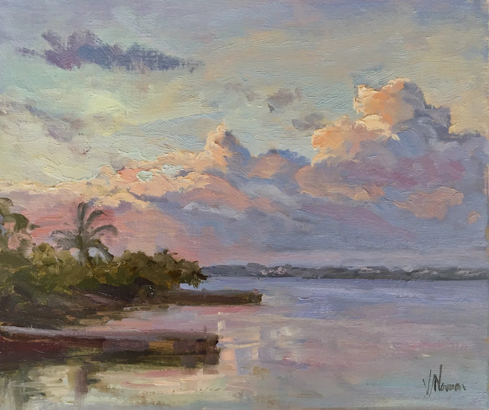
I have some very good news - my painting has been awarded the top prize at Plein Air Bermuda this weekend!

Afternoon Glow

Afternoon Glow

I received the award from sponsors Armadillo Art and Michael Harding Oils

I received the award from sponsors Armadillo Art and Michael Harding Oils

The biennial festival was created in 2015, but this was my first time in Bermuda, and what a trip it has been! 

Breakfast on Linda's terrace

Breakfast on Linda's terrace

My boyfriend Mark and I arrived in Bermuda last Thursday, a little nervous yet excited to meet our host Linda, a painter from Bermuda who offered to accommodate us in her home for 10 days over the festival week. We were delighted to find that she lives in a beautiful house with water both sides and a private dock looking out over the bay - wow! I was so excited to find that I could see the sunrise across the water that I got up each morning to make a dawn painting before breakfast!

Daybreak from Linda's dock

Daybreak from Linda's dock


Out and about on the plein air scooter!

Out and about on the plein air scooter!

We hired a scooter to get us around (visitors cannot hire cars here) and set out to explore the island, I was looking for the visual elements of the landscape that would make good motifs to use in paintings, distinctive characteristics like the white roofs on all the buildings here, or the local tree shapes that make great subjects for paintings that really feel like Bermuda. 


The festival started last Saturday with 67 artists from Bermuda and overseas meeting for drinks and starting to make friends and acquaintances. 

We painted each day in a different location, the organisers chose some great places for us. We were taken to an exclusive beach and tennis club on our first day, day two saw us welcomed to a beautiful private residence with extensive gardens, day three was in Hamilton, capital city of Bermuda for day and night time painting (yes, painting the city lights in the dark), we then visited the Royal Naval Dockyard on day four, the historic town of St George's on day five and finished with a free day to paint anywhere we liked. 

A sunny stroll on Coral Beach

A sunny stroll on Coral Beach

Garden mementoes

Garden mementoes

Dining decisions in Hamilton

Dining decisions in Hamilton

Bermuda Colours in St George's

Bermuda Colours in St George's

The Picnic Spot

The Picnic Spot


On Saturday morning we handed in up to 7 paintings each to be exhibited in the Bermuda Society of Arts Gallery in Hamilton. Judging took place in the afternoon and the show opened for just 3 1/2 hours of intense viewing and sales from 4-7:30pm. After such a fantastic week I was overwhelmed to hear that I had been awarded the prize for 'Best Painting in Show' for my artwork "Afternoon Glow". 

Afternoon Glow

Afternoon Glow

It is the first time I have won a competition of this size and I'm delighted to come away with such a great prize. It has been a very busy week, I have painted all over the island but the skies have been particularly incredible. I found a way to load the scooter to carry all my painting equipment so that I could be independent and paint where and when I wanted. That's how I made my winning picture. I spotted a great view from a dock near our host's house so I went to make a study. I had to go back 3 times, always at around 4pm when the light was best, until I had completed the painting. The dramatic golden glow in the painting only happens for a few minutes each evening, so I had to keep returning each day until I had managed to complete all the parts of the scene. It was quite tricky to transport the wet painting on the scooter, but I'm glad I persevered! 

The Tree of Knowledge

I was painting in Florida recently, as part of the ‘Forgotten Coast paint out’. We had a whole week to paint the people and places along a 100 miles of beautiful coast line – it was fabulous! And something lovely happened…

Looking for a painting location in Port St Joe, I drove around a predominantly African-American neighbourhood, there were great subjects to paint, old wooden houses in different colours, and some interesting characters too. I stopped by a derelict old house and spoke with the neighbours. I wanted to paint, they seemed ok about me being there, so I set up. As I worked, I became aware of a disturbance a few yards down the road, I got scared, there was a fight and a lot of shouting. Soon a police car arrived and then an ambulance. Was it safe to paint here? Should I leave? I was working right bedside my car and could pack up fast if I needed to, but actually, everyone I had spoken to had been friendly to me, so I kept on painting. I finished the piece and left.

"Standing on bricks" 9 x 12" Oil on board

"Standing on bricks" 9 x 12" Oil on board

As I drove away, I spotted a group of people sitting in the shade of a tree, their shape against the brightly lit concrete made a great silhouette – and a great story, a simple image that spoke of culture and community. It took me another two days to find the courage to stop and speak to them; painting houses is one thing, but painting a gang of men is quite another! What if I messed it up and they got offended? When I did finally decide to go back, I drove slowly past them, they waved and smiled and called out to me, so I parked a few yards up the road and watched them in my mirror for a moment. Did I feel brave enough to get out of the car and say hello? I did. And so, I met Chuck, and 5 of his friends. I asked if they would allow me to take a few photos, to see if I might make a painting of them. They were lovely, so warm and welcoming, they really liked the idea of being painted, and I found the perfect viewpoint across the street, in the shade of a disused shop.

Chuck and friends chatting as I paint

Chuck and friends chatting as I paint

Unsure how long the guys would stay, I had to work backwards, starting with the detail of the figures and leaving the background until later (instead of my usual approach; starting with large, rough shapes and slowly working towards the detail). With a quick plan for the design in my sketchbook I started to paint the figure to the right of the group, then worked across the group one at a time, linking the figures together with their shadows or clothes to make one solid dark shape. There was an empty chair to the right of the group, it’s shadow joined up with the other shapes and it seemed somehow to complete the picture, so I made sure I left a space for it on the edge of the canvas. As I painted, the guys took turns to come over and watch me, they were chatty and interested, they knew of the ‘paint out’ but hadn’t really been involved before, now they were intrigued. They kept calling out to each other as I painted them “Hey Leon, she just painted your legs!” this was a bad idea, it inevitably prompted Leon, (or whoever I was trying to paint at that moment) to cross the street to see themselves on the canvas – except they weren’t on there yet, because I’d only painted their legs before they moved! It got difficult, but it added to the fun, it was starting to feel like a party on the street corner, more people gathered, more chatting and questions. I worked fast to catch people when they weren’t looking.

Detail of the group of figures

Detail of the group of figures

Soon a lady arrived, she sat on the edge of the table and joined in the talk under the tree, there was a great atmosphere, a lot of joking and laughter. Then she crossed the road and asked why I hadn’t included her in the picture. I tried to explain that she hadn’t been there when I made the initial plan, but it was futile, it was clear that Elitha was part of the group, so she had to be in the painting. Then another guy arrived and he too had to be included– and so the painting evolved, sort of by accident, documenting the folks that came and went. After a while, I asked them to help me to think of a title for the piece. Straight away someone said, well you have to call it “Jus hangin’ under the tree of knowledge” -  what a great title! They explained that the tree had been named by Dave, a great local character who thought of names for everything. Then they told me Dave had passed away unexpectedly, a couple of weeks ago. They asked me to title the painting in his memory- what a lovely idea, I felt honoured. As I looked again at the painting, I saw the empty chair on the right.
“So that’s Dave’s chair then?”  
“Yes.”

Eventually, the painting was done, it was nearly dark and I was meant to be painting a nocturn session at the lighthouse around the corner so I had to rush off. That night I received a message via my website:

This is Elitha. Thank you for capturing us. It was a beautiful experience.

At the end of the week we put our finished artworks in the gala exhibition. On Saturday evening, I was just leaving when somebody stopped me; “There’s some people here to meet you”. I returned to my display and found two ladies looking at my paintings. Their names were Sedra and Whitney Barnes; Dave’s widow and one of his twin daughters, they had heard about my painting and wanted to see it. They showed me a picture of Dave, we talked about him and how his memory would live on, in the tree and in the painting. Sedra, Whitney and I signed a dedication on the back of the artwork, in memory of David Lee Barnes. Then we handed the painting to Susan, a collector who had chosen to buy the painting after she heard its story.  

"Jus' hangin' under the tree of knowledge" 12 x 16" Oil on board

"Jus' hangin' under the tree of knowledge" 12 x 16" Oil on board

Whitney, me and Sedra with the painting

Whitney, me and Sedra with the painting

A busy few months!

Well, it seems a long time since I updated my blog (again). But I promise it isn't because I've been idle - far from it - I've had a fantastic and slightly frantic few months!

So, I thought I would add some of the paintings I have been making whilst I've been away in Scotland, Ireland, France and Norfolk.

Read More

Winning Colours

A very happy and successful trip to Dublin for a workshop and painting competition. I spent a delightful 5 days painting on location with a wonderful group of people from North Dublin and surrounding areas. 

Over the weekend I took part in 'Painting the Parish', a plein air painting exhibition and competition to celebrate the 150th Anniversary of St Kevin's Church in Dublin City.  I've been focusing on the use of 'warm whites' in recent weeks. With this in mind, I decided not to use titanium white on my palette for the competition on Saturday, instead I chose warm white, warm light yellow and lead tin yellow lemon as my lightest values. I wanted to capture the warmth of the candle light inside the church. It seemed to work well - my finished painting won first prize in the competition!

Read More

Little moments captured in paint

What a fabulous time of year to be painting in Cumbria, the colours this autumn have been particularly striking and I spent a lovely few days teaching on location from Higham Hall last week.

As part of the course I gave a painting demonstration on the shore of Derwent Water, with ever changing light and occasional squally wind it was a scene fraught with classic plein air challenges!

Read More

Art in the Open

A brilliant trip to Wexford for 'Art in the Open'. I met some amazing painters and shared lots of laughs with lovely people. And that's the best bit about the whole thing, the people. Yes, Wexford is beautiful and the painting locations are always full of inspiring material, but the thing that really makes Plein Air festivals wonderful is all the plein air painters. They're just such a great bunch. Always game for a laugh, no drama, just down-to-earth, genuine, out going, friendly people. And where else on earth can you discuss the finer points of easel design for a whole hour, without anyone getting bored?!

Read More

Shropshire Calling...

I had a lovely surprise this week when I was called by BBC Radio Shropshire. They wanted to have a little chat about art and how to get started with drawing or painting. You can listen to it for the next few days by using the link in the post and forwarding through the programme to 2 hours 15 minutes. 

It was on Jim Hawkins Show on Friday 20th February at 11:15am, you can listen again on their website if my link doesn't work for your browser. 

Read More

A late night conversation

I sometimes talk about how a painting can only be ‘steered’ so far by the painter, then we have to stop, step back and ask the painting what it needs from the painter. This two way ‘conversation’ with the artwork made me scrape off a big chunk of a ‘finished’ painting this week – and I’m so glad that it did! Here’s what happened…

Read More

A trip to Tuscany

I went to stay with a painter friend in Tuscany last month. After a few rainy days in the mountains we found some sunshine by the sea in the beautiful Sestri Levante. A traditional Italian town with earth coloured houses built right up to the edge of the stunning 'Bay of Silence'.

Read More

Cloud studies

Back in August I spent a couple of days painting at Heybridge Basin on the east coast. The tail end of a hurricane was forecast to arrive the following day so I decided to get out and make some studies of the gathering clouds. These two studies were made whilst hanging onto my easel in increasingly strong winds

Read More